


Problem: Revamp UX on existing Warranty Management product on the Salesforce Platform
Role: Lead UX Architect
Customer: Tavant Technologies Product
Date: January 2018-Present
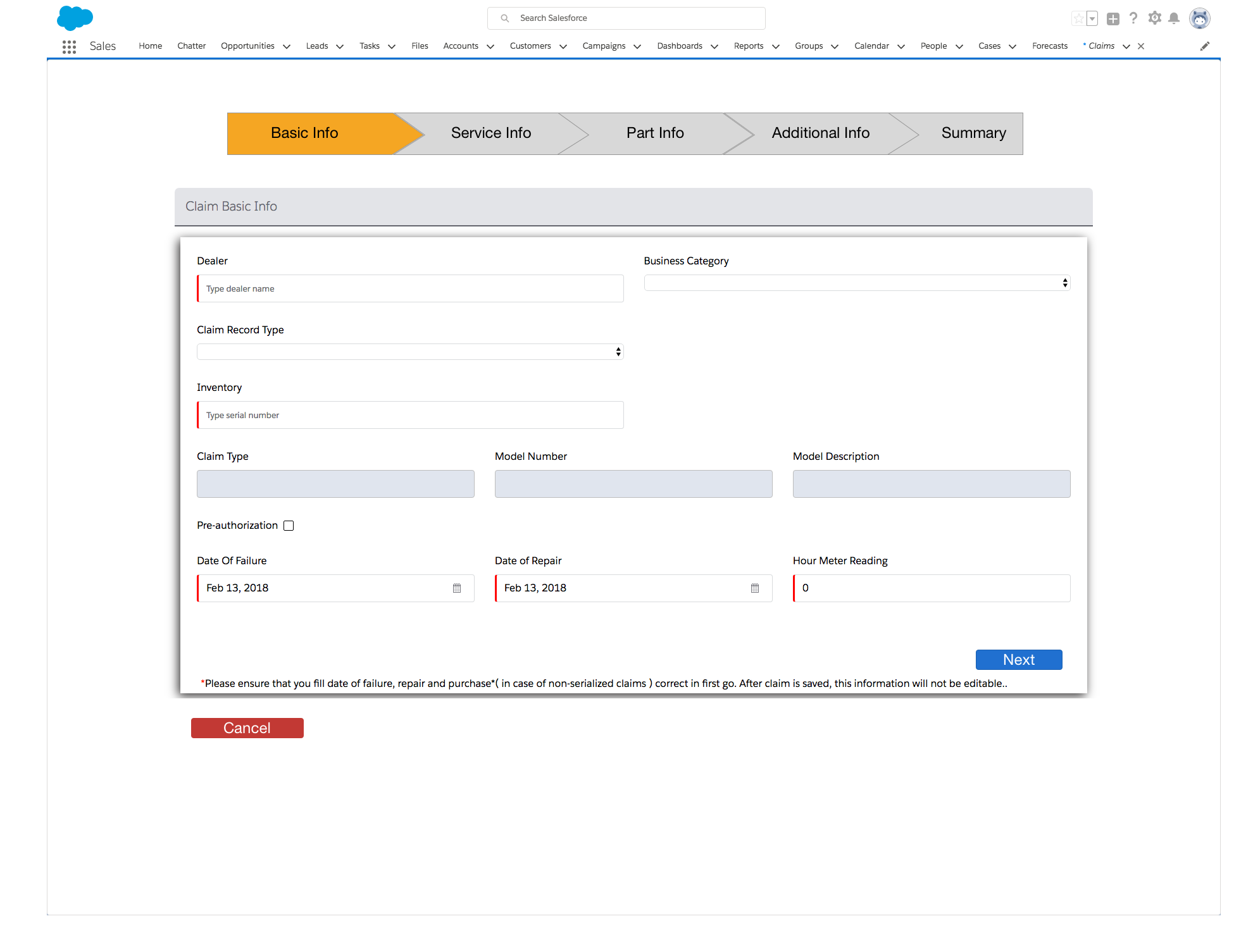
Problem: When this product was developed, there was no UX done. I was asked to go and see what I can quickly fix. I started by trying to gather as much historical used data as I could from the previous customers. I first wanted to understand which journeys were most customized by the customers during implementation. Once we knew those answers, we started to look at ways to improve it. Our first attempt was to give customers an alternative to a very long claim entry form, by creating a card version.
User Research: I reached out to some of Tavant’s current Warranty customers to understand their pain points. After making a list of user pain points, I went through and a UX best practice audit. From there I started meeting daily with the product owner and started the design phase.
Interactions/Visual Design: I worked with the product owner to plan out the changes to each page. We decided to use a combination of Lighting experience and Visual-force pages to keep a consistent look and feel thought the application. You can see some of the updated pages below.
Final Outcome: Live to happy customers